Mayco Test Tiles - Coral and Copper Float (6/9)
May 26, 2021
Hello, hello! Welcome back to my glaze test series. I'm so glad that you've decided to keep reading past the stoneware test entries. Today I wanted to show you a few tests with Coral which is a beautiful glossy pink on its own, and Copper Float. The latter I hadn't used before, and even with a lot of coats it still looks kind of drab. Perhaps a higher temperature would bring out some of the color? I'll add that to my 'need to try someday' list.
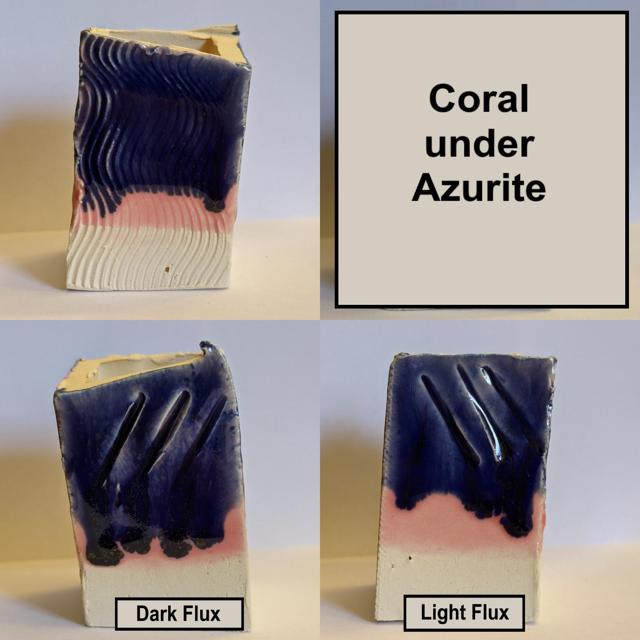
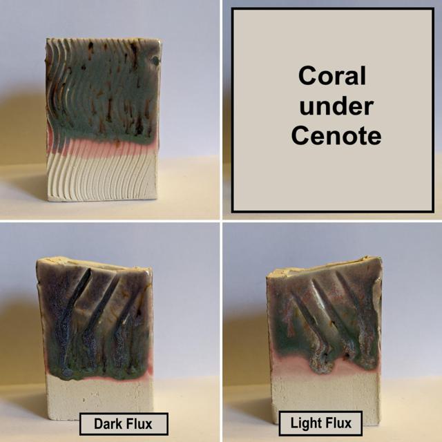
So first up is Coral. I only did a small handful of tests with this one since I've had it for awhile, but I mostly wanted to see how it looked paired up with a couple of the new stoneware glazes. I tested it with Azurite and Cenote, the two blue ones, and the results were kind of just a glossier version of them.
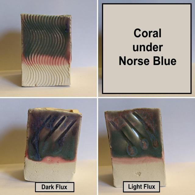
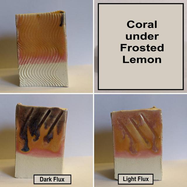
I also tested Coral with Norse Blue, Frosted Lemon, and Sandstone. The results were pretty good, and I love how the dark flux over the Coral/Frosted Lemon combo turned it purple!
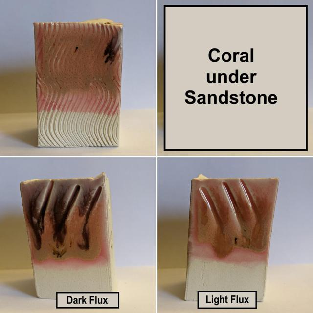
So overall good results with this one. I think I mostly prefer coral on its own though. And it really pops over a light speckled clay, which is one of my favorite ways to use it.
Next we have the Copper Float glaze. Its very dark, and like I mentioned earlier, I think I might have to test it at a higher temperature to see if any of the red or green color shows up.
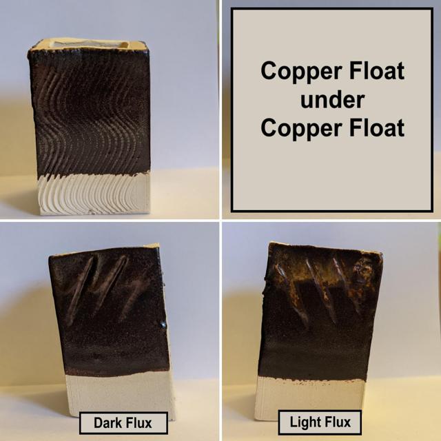
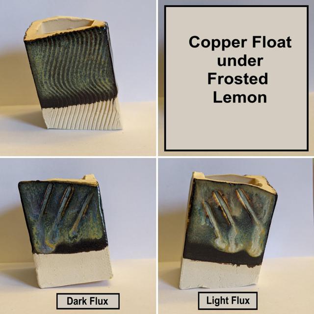
As you can see above, though, when its paired with Frosted Lemon, it definitely gets lighter (and better?), which is something not seen too often when you pair a dark glaze with a lighter one. This one was a nice surprise when it was pulled out of the kiln. I might even test a few more light glazes with this one in the future.
Coming up next are two glazes that have been out awhile but I only purchased recently: Norse Blue and Frosted Lemon! Stay tuned!
Recent posts
- March 23, 2022 - Upcoming In-Person Shows for 2022
- Dec. 22, 2021 - Flowers on Everything
- Dec. 8, 2021 - Extruded Slab Building - Part 2
- Dec. 7, 2021 - Extruded Slab Building - Part 1
- Nov. 15, 2021 - Working Large Scale
- June 10, 2021 - Mayco Test Tiles - Two Triple Combos and a Stroke and Coat Test (Part 9/9)
- June 6, 2021 - Mayco Test Tiles - Sandstone, Muddy Waters, and Green Tea (Part 8/9)
- June 4, 2021 - Mayco Test Tiles - Norse Blue and Frosted Lemon (7/9)
- May 24, 2021 - Show Reflections
- May 19, 2021 - Mayco Test Tiles - Cenote (Part 5/9)
- May 16, 2021 - Mayco Test Tiles - Landslide (Part 4/9)
- May 7, 2021 - Mayco Test Tiles - Himalayan Salt (Part 3/9)
- May 5, 2021 - Mayco Test Tiles - Azurite (Part 2/9)
- May 3, 2021 - Mayco Test Tiles - Rainforest (Part 1/9)
- April 19, 2021 - Upcoming Art Shows
- April 16, 2021 - The Art of Oribe - Testing a Classic
- Feb. 11, 2021 - First Blog Post - Welcome!